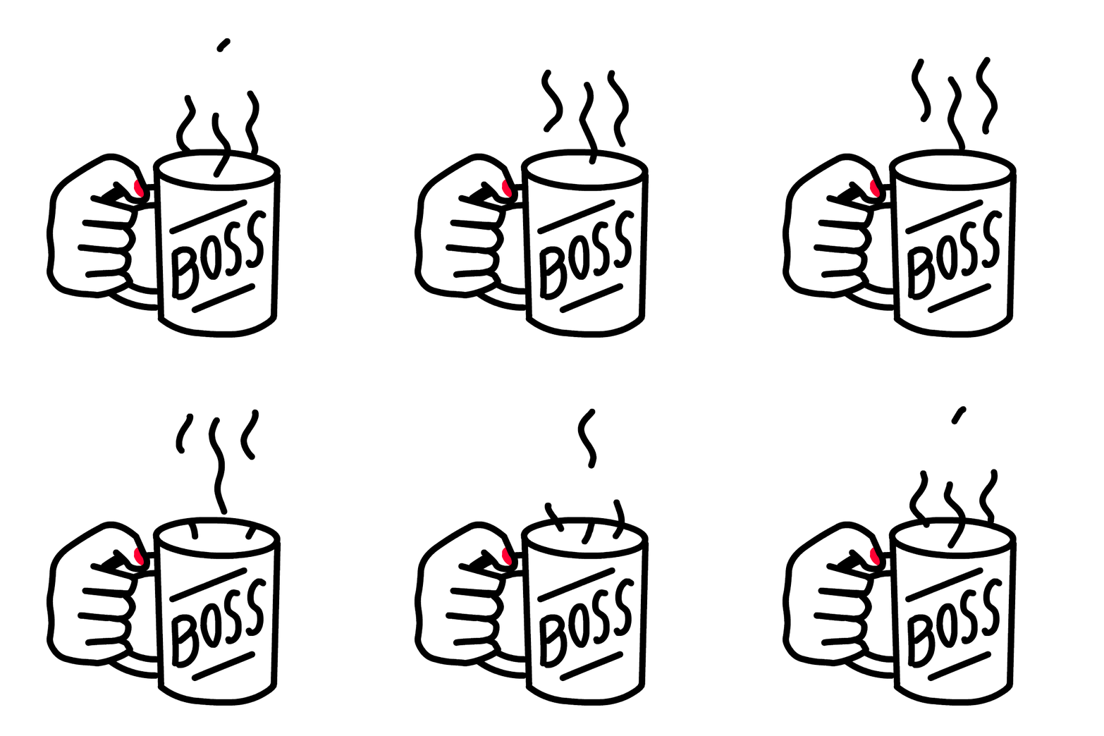
A channel icon acts as your YouTube channel’s very own brand logo. Your channel icon should be stamped across all your videos, original marketing collateral and social media posts you create. Doing this will help your viewers connect you with your channel icon and generate strong brand recall. Channel icons are invaluable in building a solid YouTube presence. And here’s exactly what you need to do to create the perfect channel icon
1. Create an abstract design
Your channel icon can be in the format of pixel art, emoticon, colourful cartoon, plain text or even your own photo. Pick one what resonates with your brand theme. For example, if you have a gaming channel, your channel icon can be in a pixel art form.
2. Relay your channel’s message
Communicate your YouTube channel’s key message through your channel icon. For example, if your channel is all about women empowerment, look at creative ways to express it. Rather than just visualising a woman, look at symbols associated with feminism – like curves, hijab, or red lipstick.
3. Make multiple sketches
Once you have a vague idea of what you want your channel icon to look like, draw your thoughts on paper. You can experiment with well over 10-20 sketches. Now it’ll get easier for you to trace these sketches onto your iPad or tablet.
4. Adhere to your brand’s colour scheme
Use 2-4 of your YouTube channel’s brand colours in your channel icon. If you haven’t already picked out a solid colour palette to brand your YouTube channel, read our blog post. Stay away from contrasting colours that could confuse your audience.
5. Minimalism is the key
Don’t throw around too many elements and clutter your channel icon. Create a simple design that’s easy on the eyes. All you need to include in your channel icon is your design. You can include your channel name in your logo until viewers learn to associate your channel with your logo.
6. Pick bold fonts
Stick to fonts that are bold and impactful. Avoid flowery handwriting, cursive letters that are hard to read. Your words should be clearly visible even when the logo is scaled down dramatically. Additionally, make sure your font fits your channel’s theme. For instance, if you’re a gipsy traveller, type in “gipsy font” on Pinterest and you’ll see fonts that run wild and free.
7. Stick to dimensions
In 2019, the ideal size your channel icon must be is 800 x 800 pixels. These ideal dimensions may change every year, so make sure you keep updated with the trends before you start designing.
8. Avoid 3D effects
Stay away from shadows, embossing and complex gradients. They can make your channel icon look unappealing and unprofessional.
You can always get a professional graphic designer or design student pitch in and fine-tune your channel logo once you’re ready to go live. Just stick to the rules and you’ll have a channel icon that sets you apart from the crowd in no time!
Interested in getting your YouTube channel seen by a huge audience? Get started here: www.flintzy.com


